Osaka,KANSAI,JAPAN EXPO2025 Design System Ver.1.0 公開Osaka,KANSAI,JAPAN EXPO2025 Design System Ver.1.0 公開

Osaka,KANSAI,JAPAN EXPO2025 Design SystemOsaka,KANSAI,JAPAN EXPO2025 Design System

The Japan Association for the 2025 World Exposition has developed the EXPO 2025 Design System to be utilized in Expo 2025 Osaka, Kansai, Japan.
The purpose of the design system is to integrate the Expo’s various interfaces and provide a consistent experience that transcends the boundary between analogue and digital. We hope the experience provided by the EXPO 2025 Design System will help the Expo deliver enjoyment to as many people as possible.

Design Policy

  1. 1

    “Living” design system
    that expresses life

    The Expo’s design system is structured to grow and evolve like an organism. We adopted this structure based on the idea that we need a “living” design system with dynamic rather than static elements in order to embody the Expo’s theme of “Designing Future Society for Our Lives.”

  2. 2

    Consistent brand experience transcending the boundaries between
    analogue and digital, real and virtual

    A consistent brand experience will be designed from a holistic approach. The Expo will have not only a physical venue but also a virtual venue. The design will enable visitors to enjoy the same Expo brand experience through physical elements such as plane surfaces, video streams, and merchandise as well as virtual technology such as augmented reality (AR) and virtual reality (VR).

  3. 3

    Experimentalness and innovation
    for exploring the possibilities of future design

    From design as a rule to design for exploring possibilities. The Expo’s theme is “People’s Living Lab; A laboratory for a future society.” Therefore, the design system is equipped with the experimentalness and innovation for exploring the possibilities of future design. We have adopted a design process that allows people and machines to co-create by leveraging algorithms and other technology. The design system will be updated like software going forward.

  4. 4

    Energy and features unique
    to the Expo

    The Tower of the Sun, the symbol of the Japan World Exposition Osaka 1970, symbolizes the energy generated by all living things in the past, present, and future. We aim to create new features unique to the Expo by developing a design system that incorporates this dynamic energy and the playfulness seen in Osaka and Kansai.

  5. 5

    Open design
    as a platform to encourage participation and co-creation

    The design elements are ID, which symbolizes individual lives, and GROUP, which symbolizes a future co-created by diverse forms of life. ID and GROUP are designed to have the potential to function as an open system. A “margin” has been left in the design to ensure expandability and encourage lots of people to participate and co-create.

Design Process

Future design co-created
by people and technology

In order to explore the possibilities of co-creation by humans and technology in the future, we have structured a design system that combines human-based and technology-based elements. The logo is based on the cell motif: a cell is born, the cell undergoes division and multiplication, and life grows and evolves. First, we designed an algorithm to visualise this system of life. The design system is capable of simultaneously providing 3D shapes that can be applied to virtual spaces such as the Virtual Expo and flat 2D images that are used in planar design. The design is not based entirely on technological elements. We intentionally had human designers make the final adjustments (e.g., parameter adjustment, shape selection) to create a design process that involves human intervention. It is a co-creative design process that leaves room for humans and machines to interact.

Concept

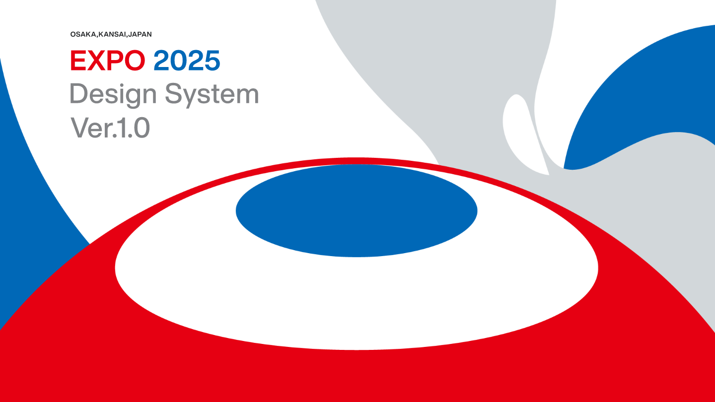
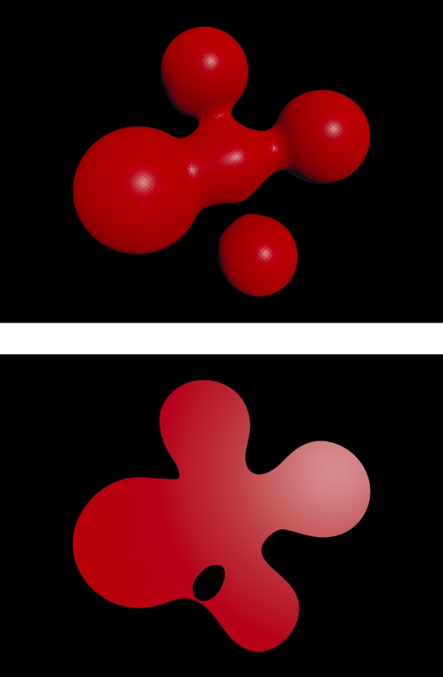
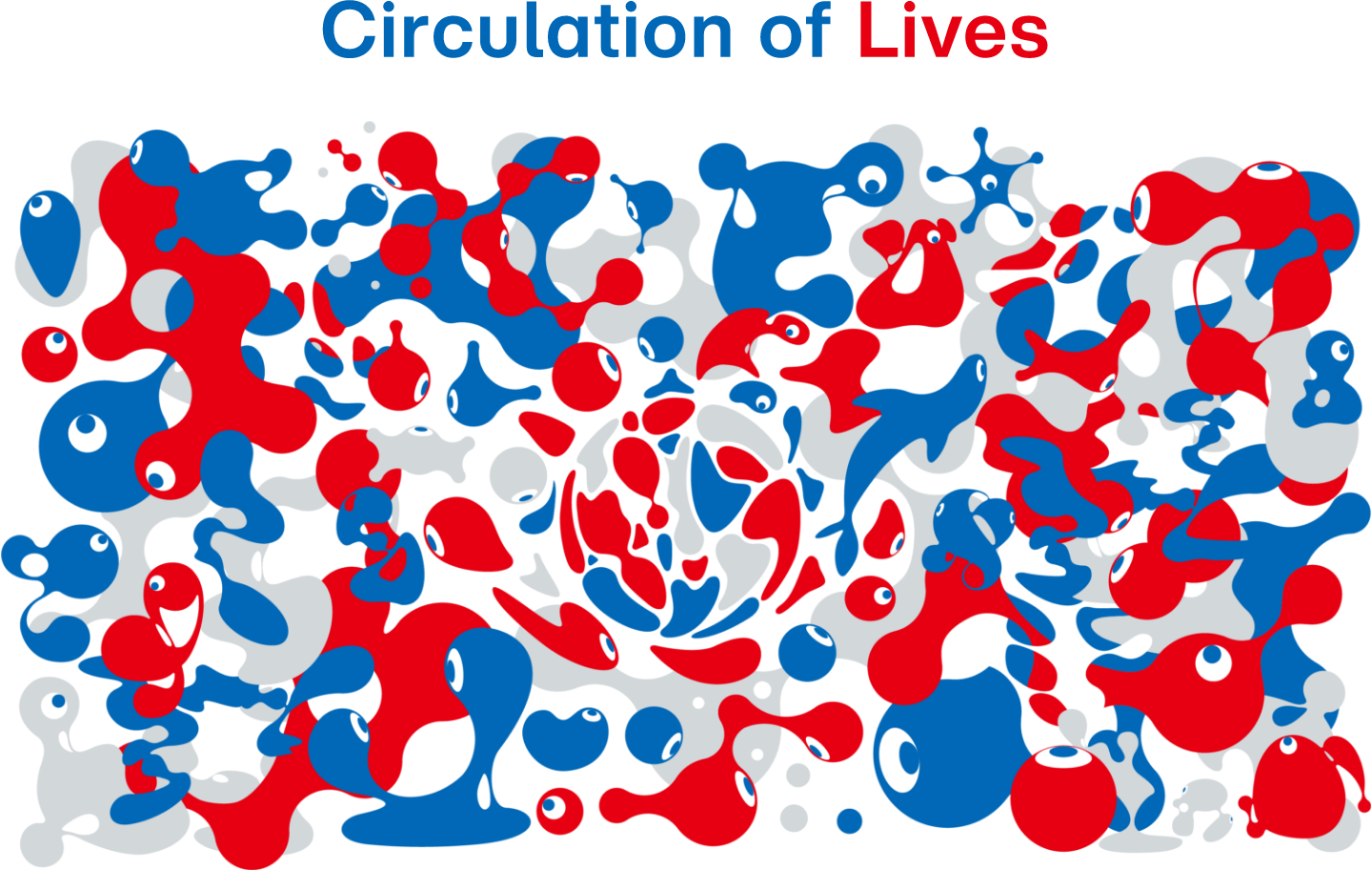
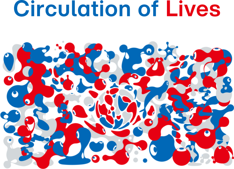
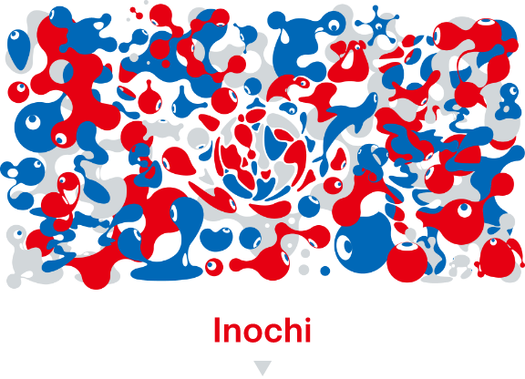
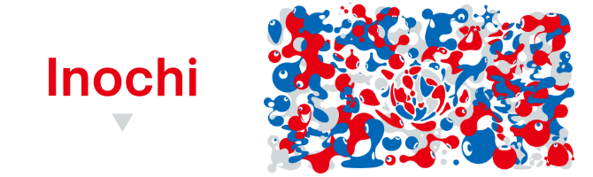
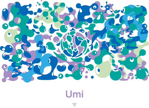
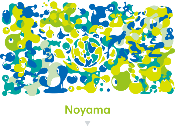
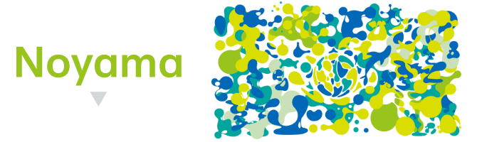
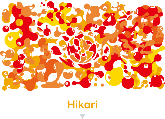
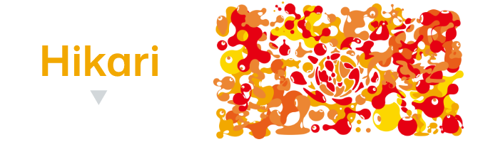
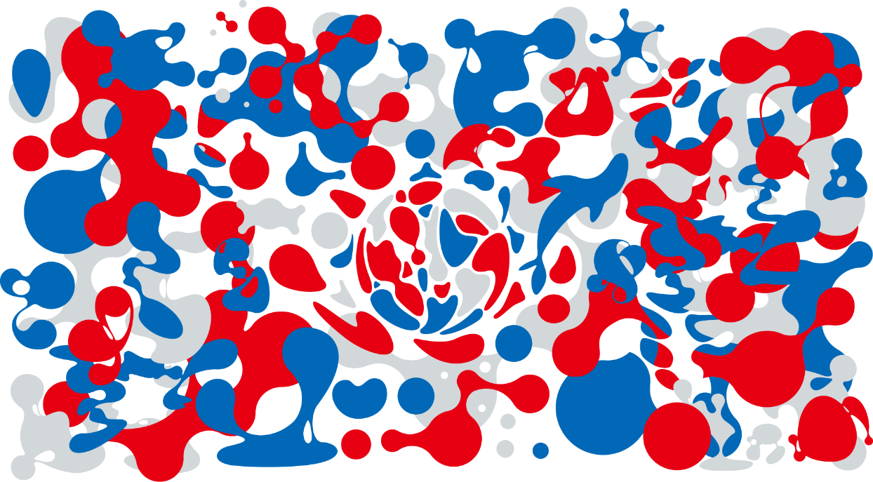
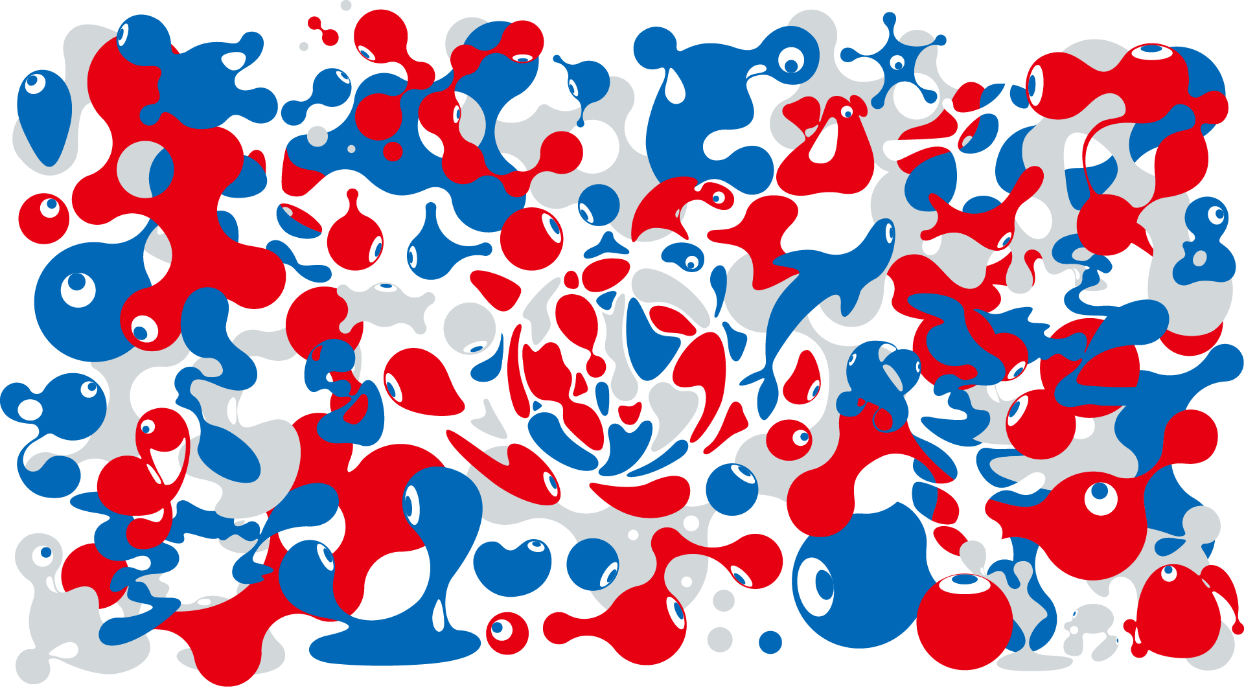
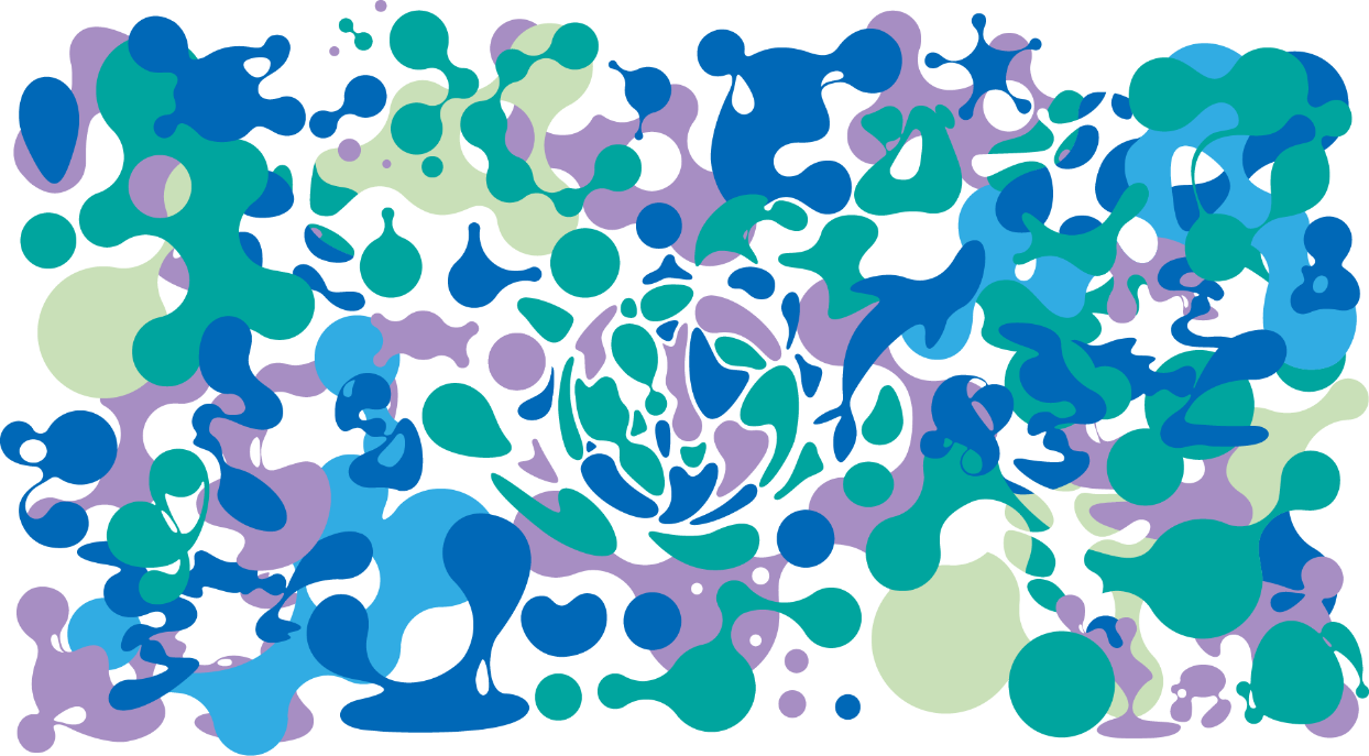
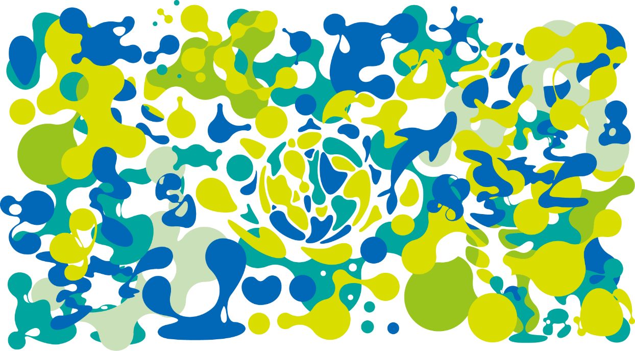
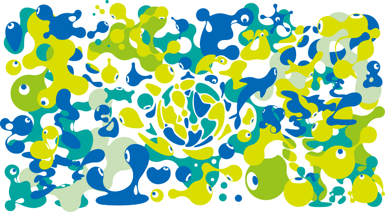
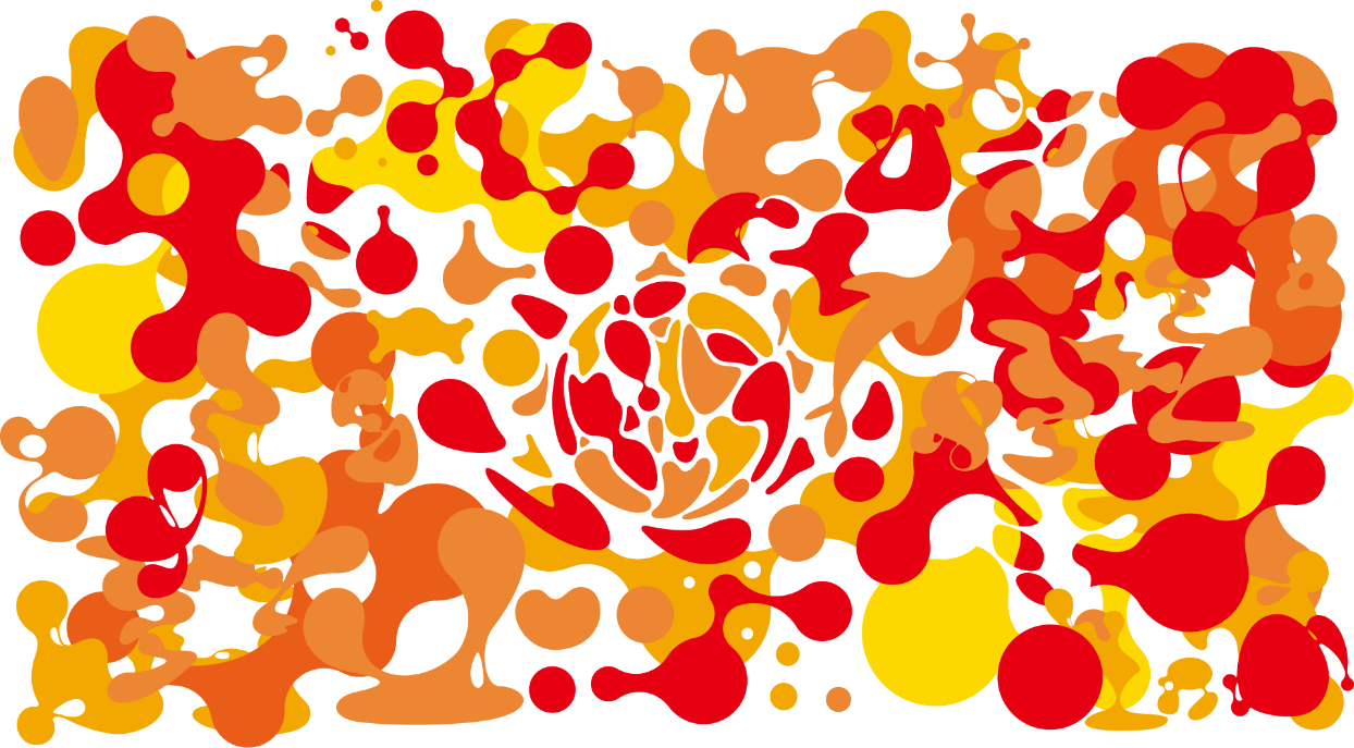
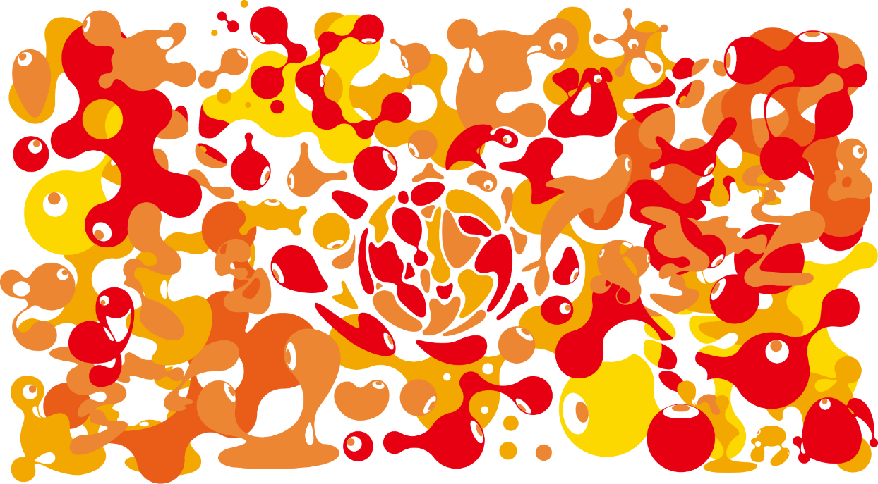
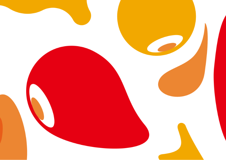
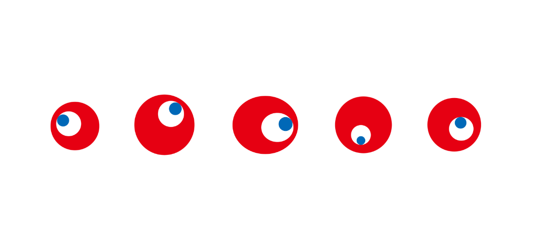
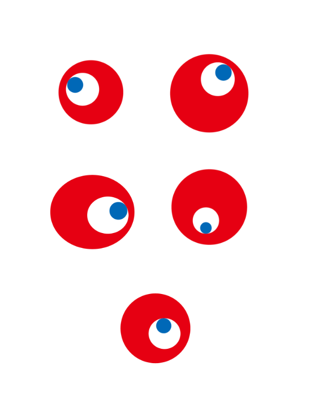
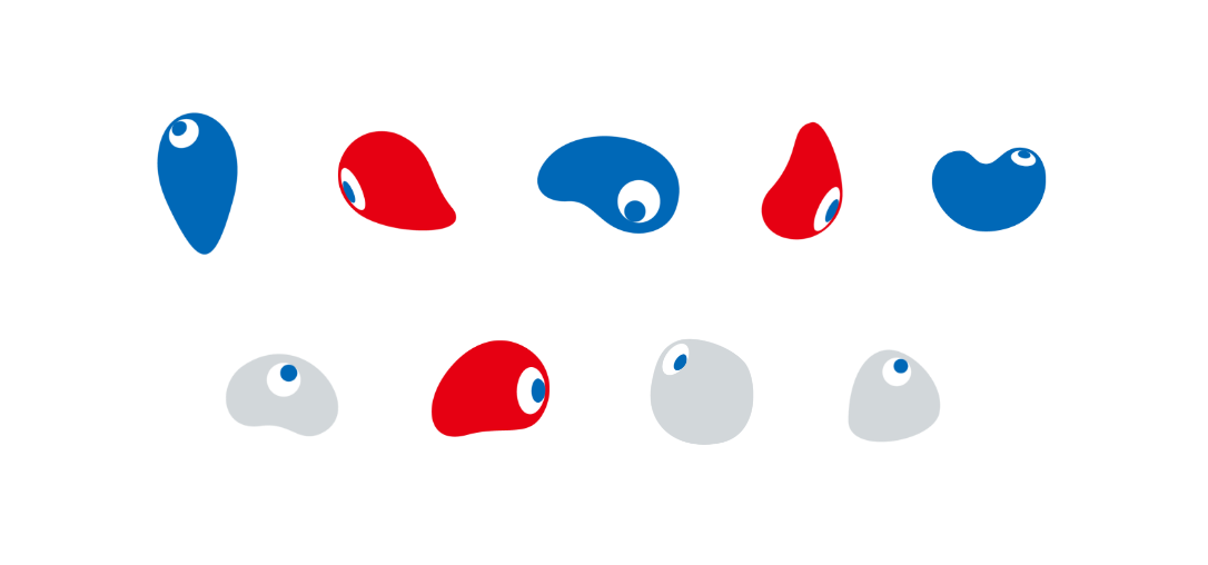
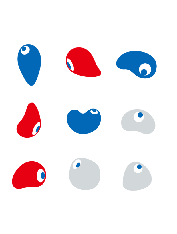
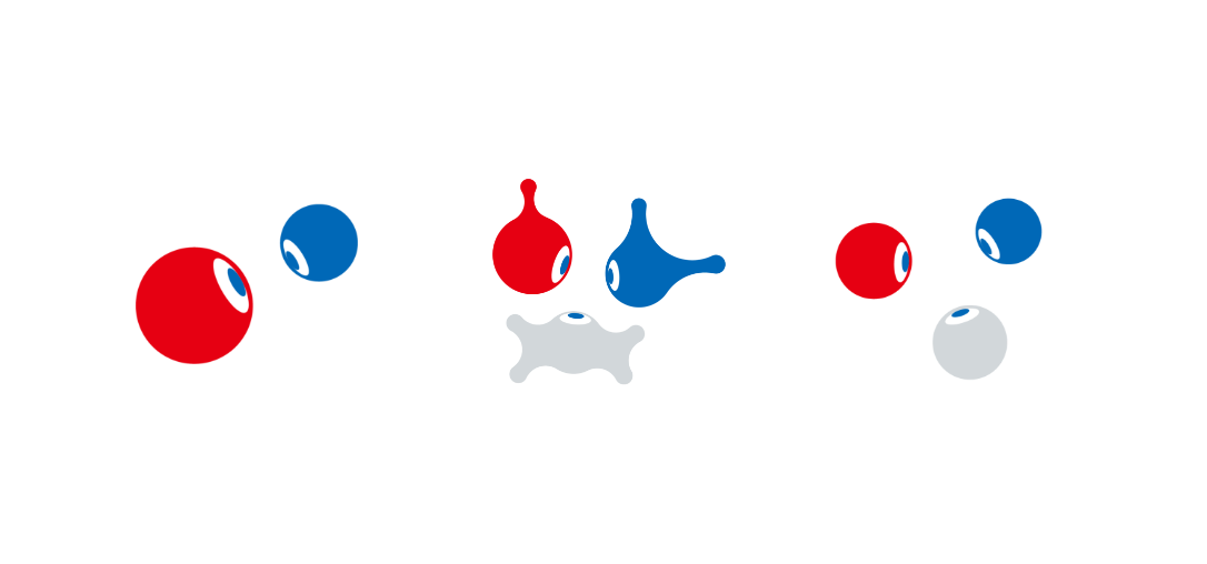
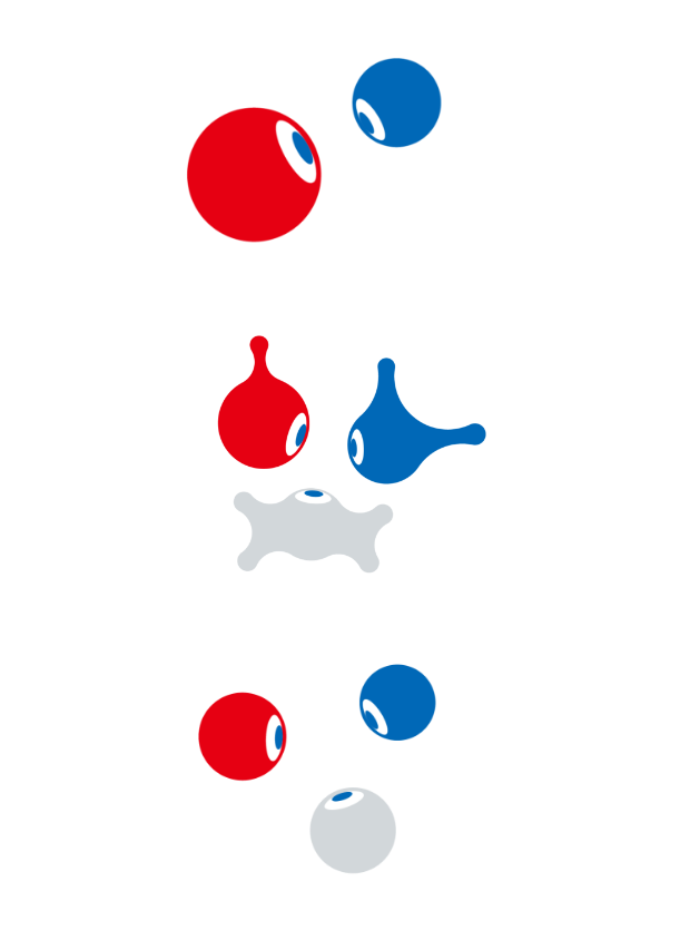
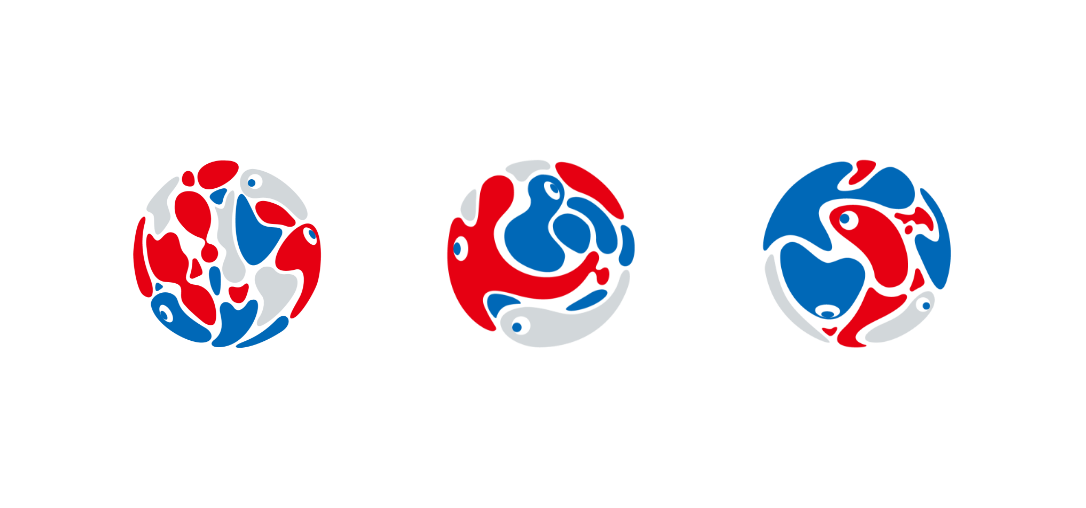
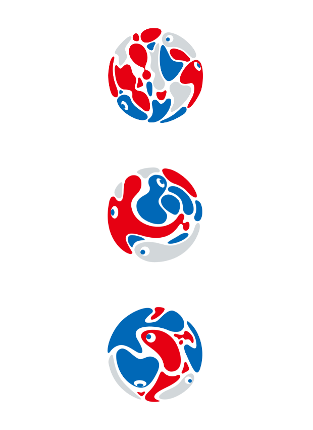
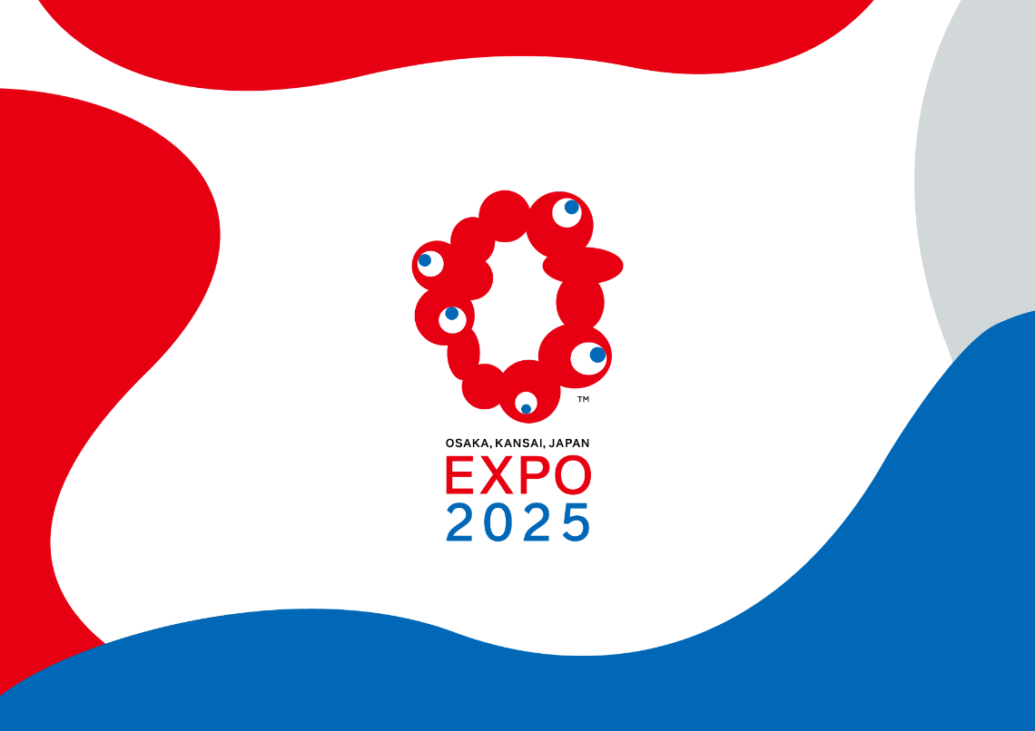
The Expo’s design system represents eternal time and the flow of life. The diverse forms of life that give colour to our everyday lives teach us the brilliance of life that is never normalised, not by forming a single centre but by endlessly connecting with and separating from each other. The beauty created through the fusion and resonation of different things will lead us to a new future.

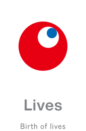
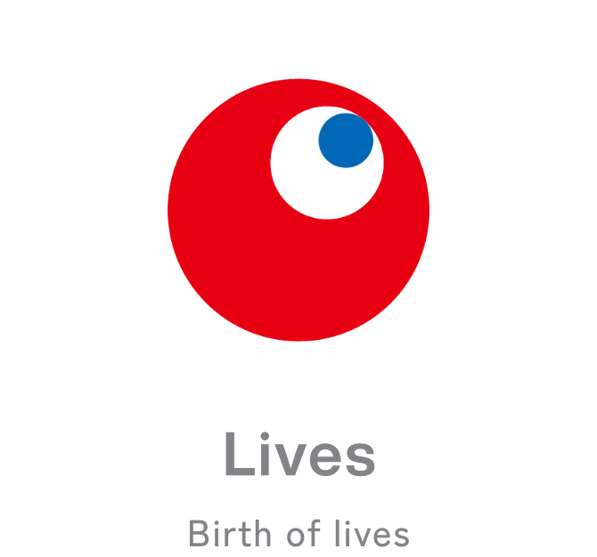
The Japanese have believed that life exists in all things since ancient times. This includes not only humans and animals but everything from insects, stones, and grains of rice to every leaf that falls on the riverbed. If we extend this world view to our modern age, one could say that new life exists in things created by technology such as AI and bioengineering. Each one of us exist as an individual and member of society in a world filled with a countless number of lives. Life exists at an individual level as well as a collective level. In order to express this idea, we have adopted a design system that can function as both an individual part and a whole entity.
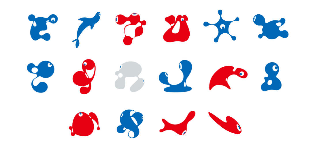
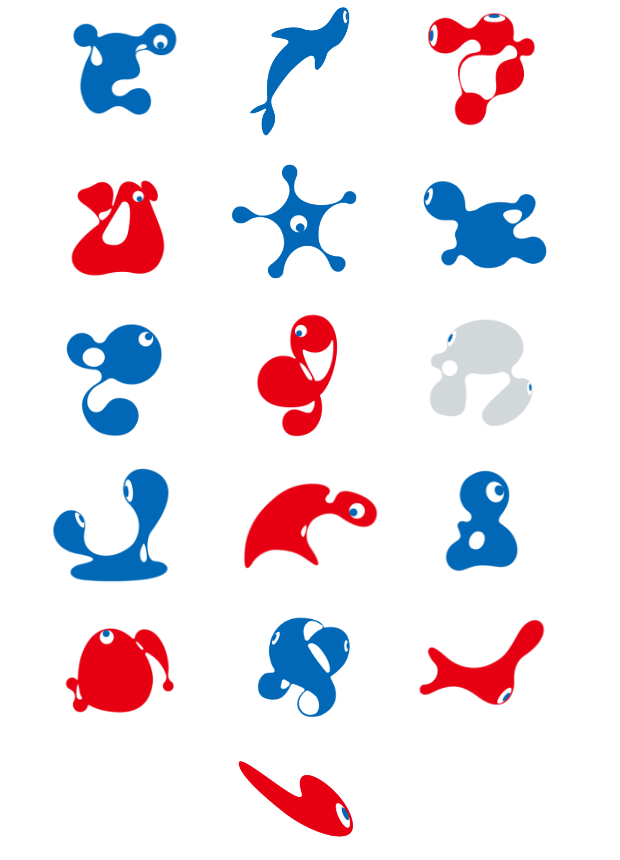
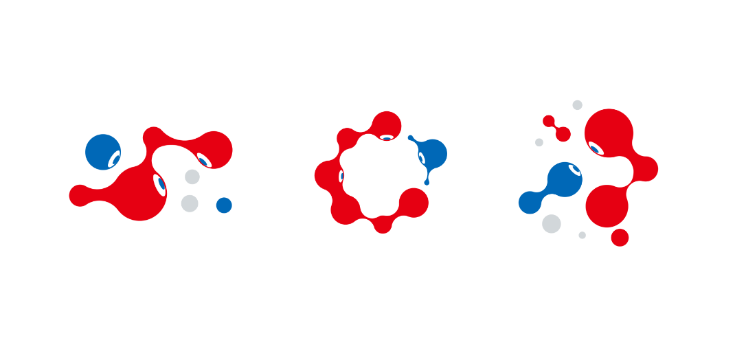
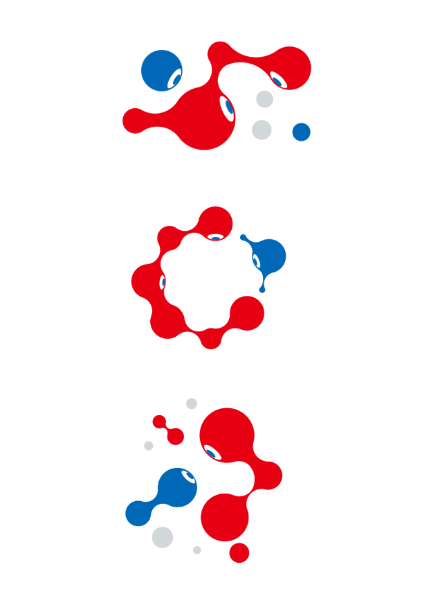
Connections are becoming stronger and stronger every day in our highly networked world. Meanwhile, disunity and opposition are accelerating as if to reject excessive connections. We are not only seeing growing disunity between people in the form of disputes and inequality, but also conflicts between humankind and nature in the form of environmental destruction and epidemics. The relationship between people and our bloated social system is precarious too.

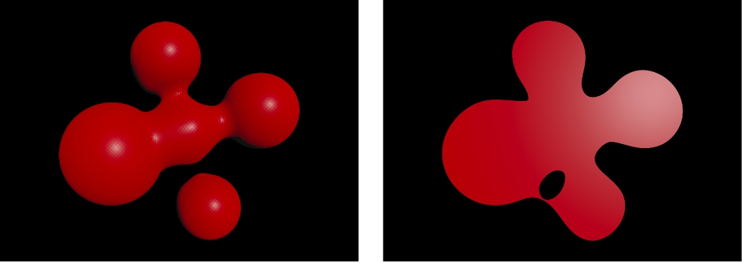
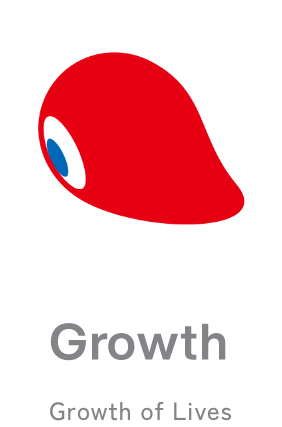
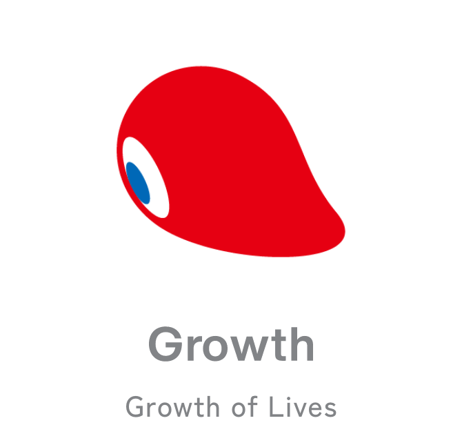
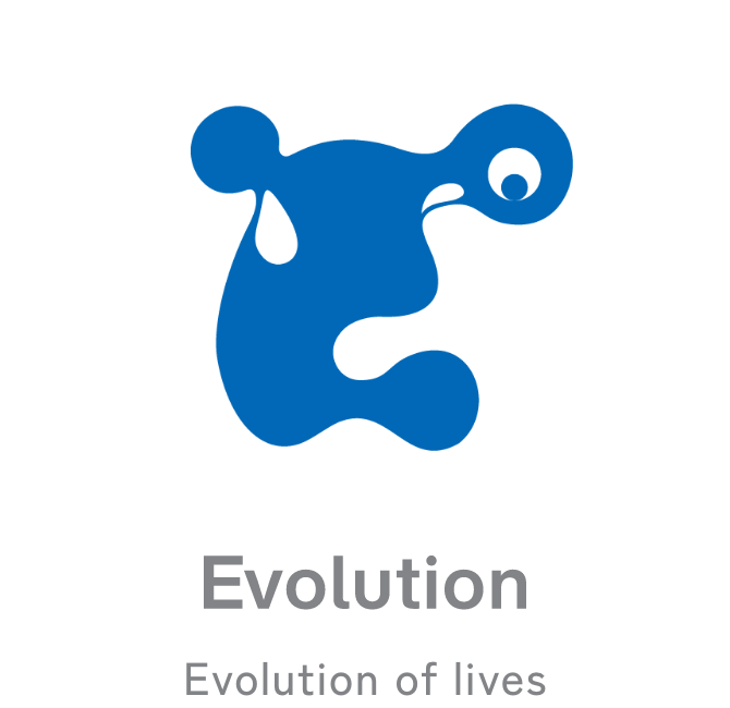
We believe the key to relieving this tension is circulation. All forms of life are neither completely connected with nor separated from each other. They keep changing while meeting and parting with one another. Eventually, the circulating forms of life are fused, creating a new existence from the chaos. This design system does not represent a nature-centric, system-centric, or anthropocentric future; it represents a bio-centric future characterised by the circulation of brilliant life.

Design Elements

The EXPO 2025 Design System is structured from three major design elements: “ID” that represents individual life, “GROUP” that represents communities made up of multiple forms of life, and “WORLD” that represents an ecosystem where diverse forms of life coexist in harmony. These elements have been chosen as they correspond to the concept of “cell,” which is the basic idea underlying the Expo’s logo. The three elements of ID, GROUP, and WORLD are designed to not only symbolise the Expo’s concept in a decorative role, but also to play a functional role in future broad development of the concept.

  • IDID
  • GROUPGROUP
  • WORLDWORLD

ID

Individual life that grows and evolves

ID is the smallest unit of the design elements, primarily used to represent the individual. ID symbolises individual life and transforms into various forms according to the growth stage of life. The state of an original cell (Lives), the growth phase (Growth), and the stage of evolution into diverse forms of life (Evolution)—each process that life experiences is represented in the design.

GROUP

Community where different lives gather to co-create the future

GROUP is a design element that represents community, a group of IDs of different colours and shapes. GROUP symbolises co-creation of a future society, which is one of the important aspects of the Expo, and represents the individual processes for a community to design a future society. Different characters meet (Join), engage in open-minded discussion (Sync), and begin acting together toward the future (Act). Ideas are created from the open relationship between individuals, leading to changes for a better future.

WORLD

Ecosystem where diverse forms of life fuse together and resonate

WORLD is a design element that symbolises a future ecosystem. Just as the world each one of us sees looks different, this element is characterised by a variety of expressions. It can be developed into countless applications by freely cutting out parts from a large core graphic. WORLD appears in several different forms—Inochi, Umi, Noyama, and Hikari. The idea behind WORLD is to celebrate our everyday lives in which we see the same world from different perspectives and in different colours.

  • InochiInochi
  • UmiUmi
  • NoyamaNoyama
  • HikariHikari

Primary Color InochiPrimary Color Inochi

InochiInochi
InochiInochi

Inochi is the main core graphic. It represents life growing through repeated cell division. The graphic features primary colours that represent cells, conveying the vigor and brilliance of life.

Examples of trimmed images
  • Inochi Examples of trimmed images1
  • Inochi Examples of trimmed images2
  • Inochi Examples of trimmed images3

Secondary Color UmiSecondary Color Umi

UmiUmi
UmiUmi

Umi vividly depicts the harmony of life undersea. Seaweed swaying at the seabed, sea fish with shiny scales, the deep blue sea, and the light blue of the shore. It shows how the ocean functions as one big organism.

Examples of trimmed images
  • Umi Examples of trimmed images1
  • Umi Examples of trimmed images2
  • Umi Examples of trimmed images3

Secondary Color NoyamaSecondary Color Noyama

NoyamaNoyama
NoyamaNoyama

Noyama is a core graphic that represents the hills and fields. Young leaves sprouting in the field, fresh verdure covering the mountain, and the light blue of clear water flowing through the valley. The graphic features sub colours that represent the beauty of life in the hills and fields.

Examples of trimmed images
  • Noyama Examples of trimmed images1
  • Noyama Examples of trimmed images2
  • Noyama Examples of trimmed images3

Secondary Color HikariSecondary Color Hikari

HikariHikari
HikariHikari

Hikari represents the ecosystem of life created from the energy of light. The light of dawn, sunlight shining on tree leaves, and burning sunset. It depicts the power of various kinds of light that surround us.

Examples of trimmed images
  • Hikari Examples of trimmed images1
  • Hikari Examples of trimmed images2
  • Hikari Examples of trimmed images3

Combinations with the official logo

Combinations with the official logo Image1 Combinations with the official logo Image2 Combinations with the official logo Image3

The combinations of the WORLD core graphics and official logo are designed in a way that allows utilisation in a range of formats. They can be used for banners and merchandise as well as in various settings such as websites and videos, heightening dynamism and producing a sense of liveliness and celebration.

Creator

Name of group
1→10 (one to ten)
Creator (representative)
HIKICHI Kota
Year of birth
1982
Profession
Creative director / Art director
Group members
ODANI Makiko / NISHIMURA Ayaka /
NAGAI Kenichi /
DOZONO Shoya /
IWAKI Iori